Color or Black-and-White?
While some subjects are stunning in monochromes, I have never liked black-and-white photos of gardens. Oh, I've heard the arguments. Such images reveal structure, stark beauty, all that. But! Seeing a black-and-white shot of a garden is like smelling a wonderful meal and not being allowed to taste it.
What do you think about black-and-white garden images? I am trying to be open-minded. Black-and-white tones can be especially evocative of winter's muted spirit. To challenge myself, I looked at the following January scenes around my garden in both color and black-and-white. I confess, there are a few I prefer in black-and-white.
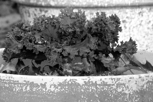
decorative cabbage:
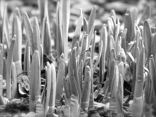
emerging bulbs: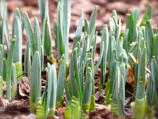
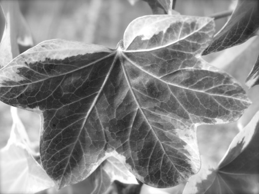
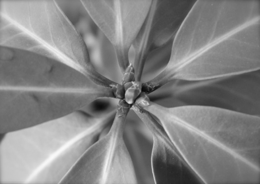
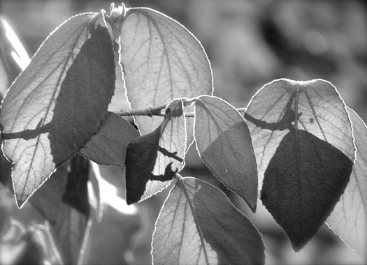
fatshedera leaf:
autumn fern fronds:

Florida anise:
hellebore:
cross on red leaf:

rippled sky:
sunset in trees: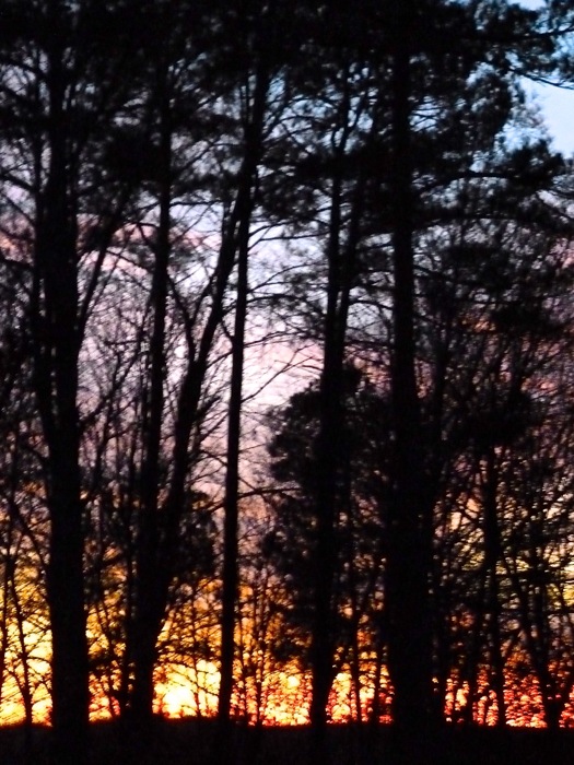

tree shadows:

blue sky and trees:
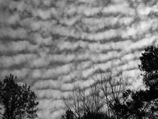
swirling cloud:

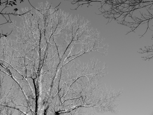
trees at woodland edge: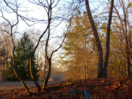

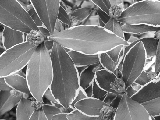
viburnum leaves:
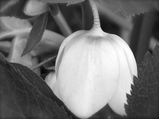
winter daphne: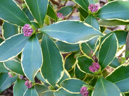
bare winter woodlands: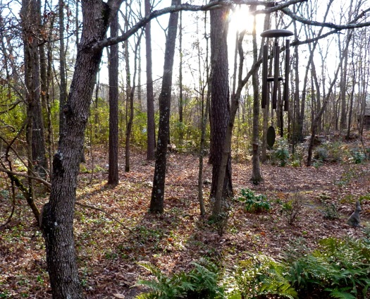

little rabbit:

What do you think? Were there some you liked better in black-and-white? Or others you preferred in color? I hope you had as much fun with this as I did!
Have a great week!
 16 Comments
Reader Comments (16)
Charming nature pictures! I admit that I am delighted with your combination of colors !
Have a nice day !
I usually like garden photos in color, too! The only ones I liked better in black and white for yours were the autumn fern fronds and some of the tree photos. I think to be a really good black and white garden photo, there needs to be some sort of shape or structure or strong lines that the contrast brings out. Black and white photos evoke a different mood, a more somber tone. That's not a mood I usually associate with gardens :)
I too prefer garden and landscape images in color, and prefer the color versions on all but the last one of your pictures. In the last one the cute bunny looks as though he has been transformed into an evil bunny in the black and white version. lol The color and black and white images of the bunny make an interesting juxtaposition.
I think black and white images are a tool to understanding the structure in a garden so it isn't a question of preferring them, it is that you aren't sucked in to looking at flowers. Most of your images were of individual plants so they don't tell you how the form and texture of the plants work together. I think they are most useful where you aren't happy with an area, when you see it in monochrome it is easier to see what is wrong. Probably a bit unnecessary in your garden anyway as it is all so well considered anyway.
Black and white is good for seeing texture in vignettes in the garden, differentiating masses of plants and a few other design tricks, but I agree, it is nicer to see the photos in their full color.
Hello, Deb, to my mind, for a black-and-white to be successful, it needs a lot of contrast such as the tree trunks and shadows with lighter backgrounds. But with the sunset one, so much is lost in b&w, and the little rabbit needs the warmth of the terracottta coloring to go with its cuteness. The rippled sky could go either way, but I like my skies blue and my gardens green. I envy you your healthy looking daphne. It's very difficult to grow here, but I try because it smells divine.
There's place for B&W photos but colour, colour, and colour for me! Lots of grey in winter enough as it is ;)
just the fern fronds, for the sculptural pattern.
But gardens, I prefer in colour.
Color definitely! Black and white works well when the focus is entirely on the structure of the composition - I liked it best in your tree photographs but still prefer the color versions. I suppose in a gallery-style arrangement, the black and white can bring the assemblage together, increasing its net impact.
I agree with your general assessment of black & white. I like to see it used when you want to make architectural detail pop, but definitely not for a garden photo.
I love color. Black and white is good for noir movies, but that's about it in my book. Great pictures, by the way!
Deb I do like monochrome more and more but not for garden shots unless there are some great textures or shadows. The ferns were awesome above as were the trees and the light through the viburnum. I like to play with black and white to see what different aspects I might spot that are pretty cool.
Hmmm, I have never taken black-and-white photos of plants and flowers, have never occurred to me actually. I have taken of people and landscape, but I think I prefer plants and flowers in full colour. The tree photos were great in black-and-white though :-)
Color color color!! Black and white is too blah for me.
Maybe I like the black and white 'blue sky and trees' and 'viburnum leaves' just as much as the colored version. Maybe.
I think we all agree that lots of color is best for garden photography. However, the fern fronds look quite stunning in black and white. I recently decided that I wanted a large black and white photo in the family room, and it took quite some time to sift through mine to see which looked best in monotones. I finally decided on a sunset shot, with a lighthouse in the background, waves crashing, and grasses swaying in the foreground. It takes lots of texture to make it work!